Brandbook · v1.0 · 2026
The GRIDZ identity system.
How GRIDZ.AGENCY looks, sounds, and behaves — everywhere. One wordmark, five colors, two typefaces, and a voice that never wastes a word. This is the system behind every page, post, and pitch we ship.
A wordmark built on the grid.
The GRIDZ identity is typographic-first. The full wordmark is used in headers and formal applications; the GZ monogram works at small sizes — avatars, favicons, and app icons.
Primary wordmark — on ink
Monogram — light
Monogram — signal red
Clear space
Keep padding equal to the height of the period mark on all sides.
Minimum size
Wordmark: 120px wide. Monogram: 24px. Below that, use the monogram only.
Don't
No stretching, recoloring outside the palette, drop shadows, or outlines.
Paper, ink, and one loud signal.
The palette is deliberately restrained: warm neutrals carry the layout, signal red does the pointing. Red is a tool, not a wallpaper — it marks action and emphasis only.
Signal Red
Accent, CTAs, emphasis — never more than 10% of a layout
Ink
Headlines, body text, dark sections
Paper
Primary background — warm, editorial cream
Stone
Secondary surfaces, cards, bands
White
Cards, navigation, contrast surfaces
Typical layout ratio — neutrals dominate, red signals
Editorial serif, working sans.
Two typefaces, two jobs. Instrument Serif gives the brand its editorial voice in display sizes; Inter handles everything functional — body copy, UI, labels, and data.
Display — Instrument Serif
Aa Bb Cc
Italic carries emphasis.
Headlines, pull quotes, and statement lines only. Always tight tracking (−0.02em), line-height near 1.0, never below 24px.
Body & UI — Inter
Aa Bb Cc
Body copy runs at 15–18px with relaxed leading. Weights 400–600 only — bold is for emphasis, never decoration. Labels use uppercase with 0.2em letter-spacing.
Like this label · 12px / 0.2em
We write like we design — nothing wasted.
Direct over clever
Say the thing. Wordplay never beats clarity.
Proof over promises
Numbers, case studies, and process — not adjectives.
Calm confidence
No hype, no exclamation marks, no urgency theatre.
Editorial, not corporate
Write like a sharp studio, not a procurement deck.
Sounds like us
- “We build content systems, not posting schedules.”
- “One shoot becomes weeks of platform-native content.”
- “From CAD $4,500 — quoted after discovery.”
Never us
- “We're a 360° full-service synergy-driven agency!”
- “Unlock explosive viral growth today!!”
- “Best-in-class world-class solutions.”
Warm, tactile, intentional.
- Warm, natural light — never flat studio white
- Real materials and texture: paper, wood, fabric, marble
- Editorial composition with generous negative space
- Red appears as a deliberate accent inside the frame



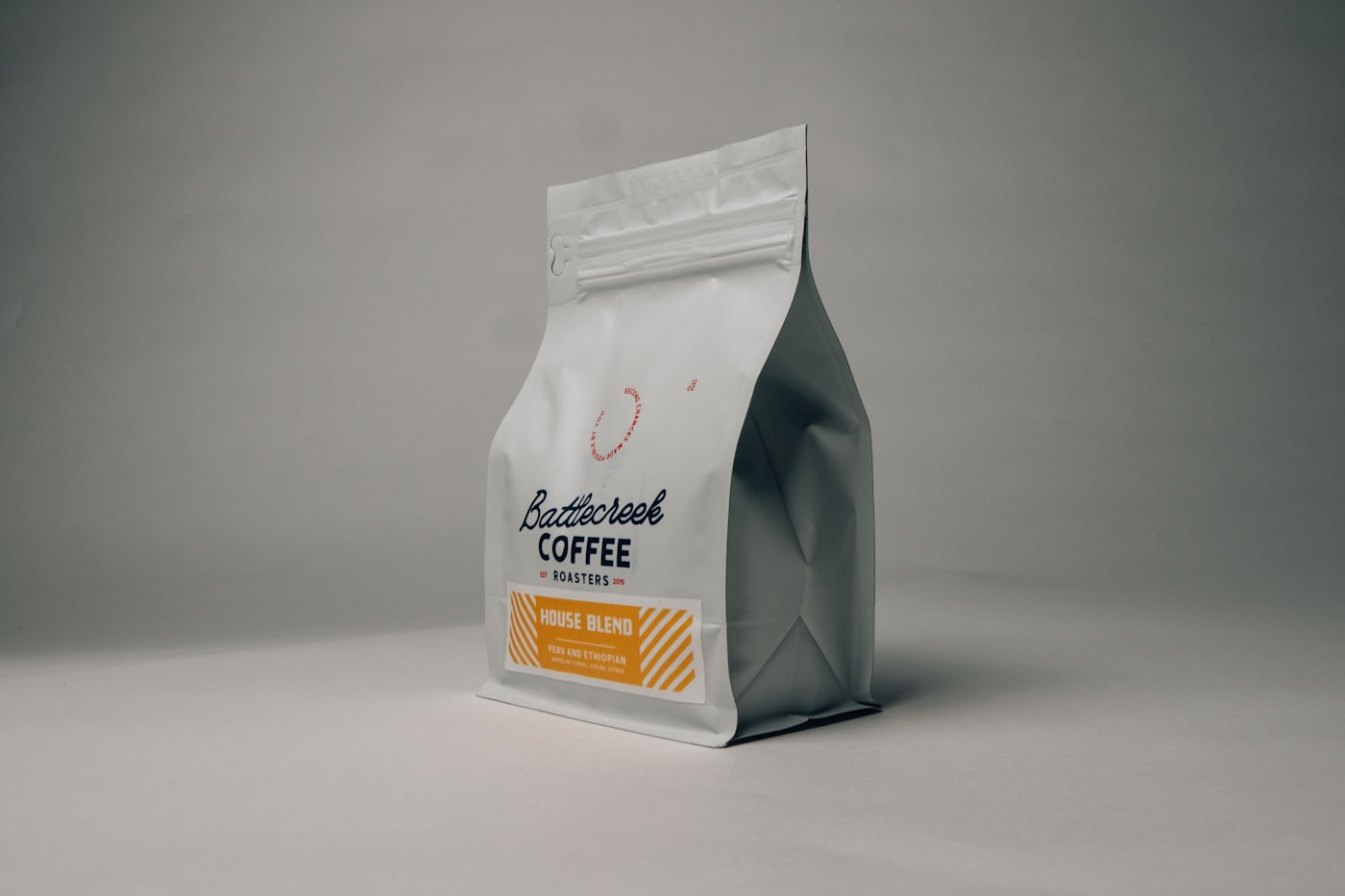
Want one of these?
We build identity systems like this for clients.
Logo direction, color, typography, templates, and guidelines — designed to be used, not admired in a PDF.